Add color to your work...
"Give it your own twist!"
A great way to give your own creation your very own twist is by adding some colors. Color allows you to create our own individuality and flare. By using colors you can also make your work stand out or blend in to your surrounding. Colors can tell a lot about a work of art.
Colors can also be used to evoke a certain mood or express emotions. Mood means the feeling we get when we look at art work. We can create the mood by selecting warm or cool colors that remind us of emotions that we want to reflect in our artwork. (For example bright colors can make you feel happy while darker colors can make you feel sad). In fact, research shows that color can play a major role in our overall state of well-being. The colors we surround ourselves with directly influence the way we feel.
It is not always necessary to add colors it is a choice. You can choose to use one color for a clean contrast or use more colors to create a more playfull contrast or to create more definition.
Even though there are no rules to being creative, there are some basic techniques that you can keep in mind when using colors. I will give you a couple of tips.
Choosing the right color...
There are a lot of different colors and shades to pick from. Finding the right color combination (for you) can be difficult. Some colors will combine better together than others.
What colors do you like? How would you like to use color? What mood or feeling do you want to create? What colors will or will not match? Where are you going to hang/place your artwork?
Use colors to emphasize your work. For example you can use complementary (also known as supplementary or contrasting) colors when you want something to stand out. Ideally, use one color as background and the other as accents. Alternately, you can use tints and shades (a lighter tint contrasted against a darker color). Complementary colors have a strong visual impact when placed alongside another. Use light (pastel) colors for a more calm effect or use bright striking colors for a more dramatic effect.
Tip: Use a basic color wheel (In color theory, colors are organized on a color wheel) to see what colors to combine best. It will guide you in making color choices.
How to add color...
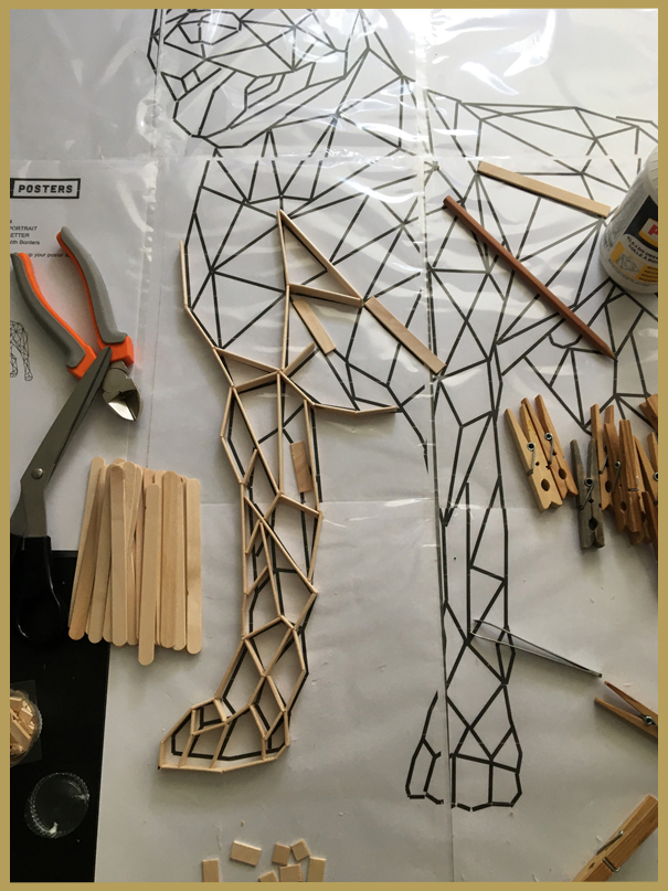
You can apply color to your work with different materials like paint, colored paper, colored sticks, glitter ect.
Or add colored accessories like rope, beads or feathers ect. (or combine).
Just have fun and bring some color into your life! There are no rules!
I will give you some examples of how to use colors for inspiration. You are free to be creative in your own way and pick your own colors. (I picked some colors I liked for this design but of course there ar many more options.)
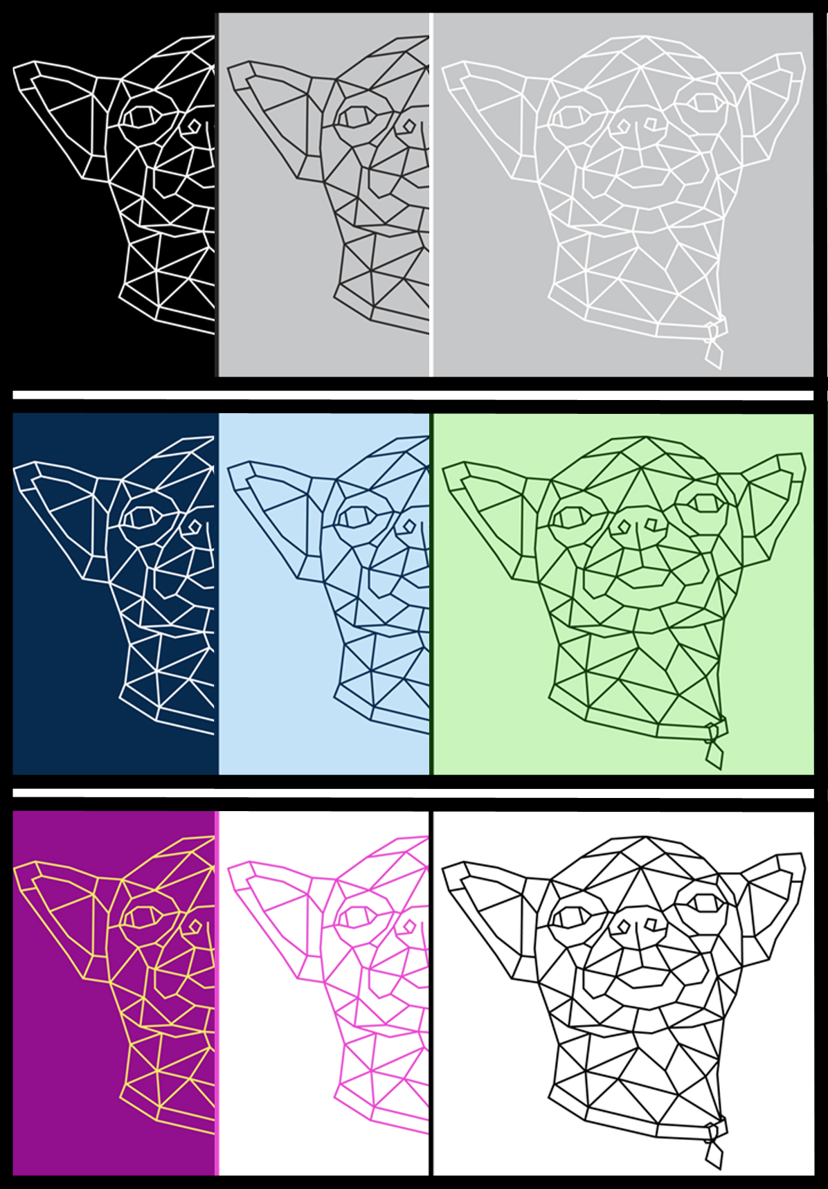
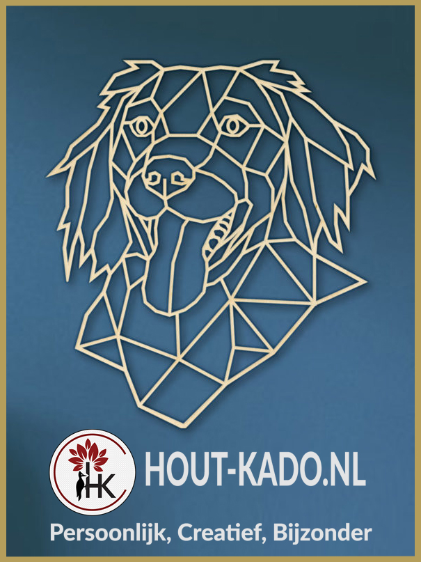
Color the lines and/or backgound
Tip: Use light and dark colors to make your work stand out against a background.
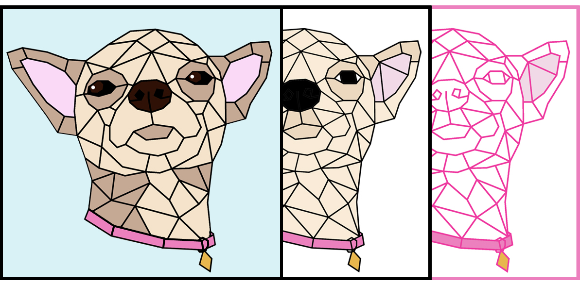
Color in an entire area (and/or lines)
Tip: Fill in the color of the eyes, clothing or fur to give your work more definition and to emphasize specific features.
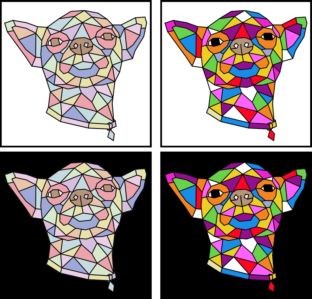
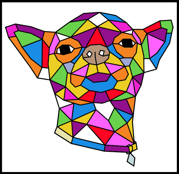
Or make a colorful (playful/fun) design using a lot of different colors
Tip: Use light (pastel) colors for a more calm effect or use bright striking colors for a more dramatic effect.
Fun fact: Color is perception. Our eyes see something (the sky, for example), and data sent from our eyes to our brains tells us it’s a certain color (blue). Objects reflect light in different combinations of wavelengths. Our brains pick up on those wavelength combinations and translate them into the phenomenon we call color. So if you are wondering if everyone see the same color? The short answer to this question is that everyone's eyes see the same colors, but we don't know if their brain's are interpreting that in the same way.
YOUR OWN CREATION